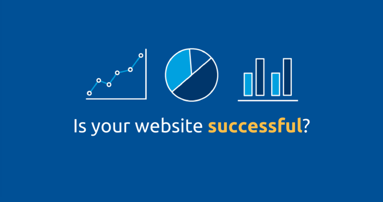
Data Storytelling for Web Analysts: How to Educate & Persuade Using Data

Have you heard the story about the web analyst who skyrocketed the prestige of web analysis in his organization, captured the imagination of his bosses and colleagues, and massively improved his organization’s web presence, all through the power of data storytelling?No, me neither.Let’s change that!
In this comprehensive guide, I’m going to give you a step-by-step framework you can use to present data that educates and persuades. You’ll learn how to take data and turn it into storytelling gold.If you’ve ever been asked to give a data presentation and thought to yourself “How do I start?”, “What do I present?”, and “Is it too late to call in sick?”, then this article is for you.Here’s what you’re going to learn:
- Why stories are so powerful for educating and persuading
- What “data storytelling” is
- How to effectively use data storytelling in your web analysis presentations
Why Stories are So Powerful for Educating and Persuading

Data Storytelling Consultant
People hear statistics, but they feel stories.
Think about your most enduring memories. Were they bland moments when you were being presented with statistics? Probably not. If you’re like most people, you remember moments that involved strong emotions.And the highly influential role of emotions in memory, decision-making, and behaviour has recently become the subject of some compelling research. What’s the connection with storytelling? Simply put, stories engage our emotions, and engaged emotions have a strong connection to memory and persuasion.

Is this how audiences react to your web analysis presentations? Source
Stories are Memorable
Did you know that stories are 22 times more likely to stick in a person’s mind than just data over a long period of time? Stories are memorable because they engage the emotional parts of our brain. In one study students were asked to give a class a 1-minute pitch for a product. The presenters used, on average, 2.5 statistics to describe the product. Only one presenter told a story. When the audience was surveyed after the presentations, only 5% remembered any of the statistics, while 63% remembered the story.
Stories Persuade
Recent neuroscience is pointing increasingly to the idea that ALL decisions are made using emotion, not logic. In fact, it’s frequently heard in marketing that “we buy on emotion and justify with logic”. And relatedly:
“Data makes people think, emotions make them act.”

Neuroscientist
Supporting this statement are studies that have found that when people experience damage in parts of the brain that control emotion, they find it difficult to make even simple decisions, like what to eat.

In his book Descartes’ Error, the neuroscientist Antonio Damasio profiles a patient named “Elliot” whose prefrontal cortex was damaged by a brain tumor. Before the tumor, Elliot functioned normally, but after his prefrontal cortex was damaged – basically shutting off the parts of his brain where emotions were triggered – Elliot would spend hours making simple decisions, like how to file a document. Damasio concludes that “when emotion was impaired, so was decision-making”.
An Example of Storytelling Motivating Behaviour
Have you ever noticed that the marketing materials charities use to fundraise are filled with stories about the people who are benefiting from donations?That’s because the charities know that telling stories about vulnerable individuals creates an emotional connection to their cause. Here’s a quick example: in a study conducted at the University of Pennsylvania, researchers tested two versions of a brochure for the charity Save the Children. The first version was loaded with statistics on problems facing children in Africa. The second version also had statistics, but in addition contained a story called “A Day in the Life in Mali with Rokia”, complete with a picture of Rokia.The result? The story-based brochure received more than double the donations-per-participant than the stats-based brochure.Simply put: stories are much better at triggering emotion than statistics.

Dr. Jennifer Aaker
Stanford University
Research shows our brains are not hard-wired to understand logic or retain facts for very long. Our brains are wired to understand and retain stories. A story is a journey that moves the listener, and when the listener goes on that journey they feel different and the result is persuasion and sometimes action
Check out this awesome lecture by Professor Aaker called The Power of Story (note: the first 30-35 minutes is most relevant to the public sector; the rest is more corporate-y).
Why You Should Use Stories and Data
As mentioned above, neuroscientists increasingly believe that human beings make decisions based on emotion, then rationalize their decision with logic. That’s why presentations (or any communication) should use stories and data – because then both the emotional and intellectual parts of the brain are engaged. Again, here’s Dr. Aaker:
No one says facts and figures should be completely eliminated from your storytelling. When data and story are used together, audiences are moved both emotionally and intellectually..
So by telling stories with your data, you’ll not only educate and persuade – you’ll graduate from report monkey to analysis ninja. But there’s one more element that you should add to your presentations to make them even more powerful: visuals. Combining stories + data + visuals is a persuasion trifecta, and you become a data storyteller.So if this is how people typically react to your data presentations…

…read on to learn how you can captivate, educate, and persuade them – through data storytelling.
What is “Data Storytelling”?
Data storytelling is defined by Brent Dykes this way:
Data storytelling is a structured approach for communicating data insights, and it involves a combination of three key elements: data, visuals, and narrative.

The three elements work this way:
- Narrative + data explain to your audience what’s happening with the data
- Data + visuals enlighten your audience to insights that might be hard to see without charts, graphs, or other types of visuals
- Narrative + visuals engage your audience and move them closer to action (use these tips for even more effective persuasion)
I’ve already covered why data and narrative (i.e. “story”) are so important to storytelling…But why add visuals?The Danish physicist Tor Nørretranders created this diagram that shows the “bandwidth of our senses”:

As you can see in the diagram, our sense of sight (the large blue area) has by far the greatest bandwidth – ten times as much as touch, and one hundred times more than hearing or smell. In other words, we’re able to take in stimuli much, much faster using our vision than any other sense. To understand just how powerful visuals using data can be, watch this fascinating 18-minute TED talk by data journalist David McCandless:
Here’s one key quote that I pulled from David’s presentation:
Visualizing data like this is a form of knowledge compression. It’s way of squeezing an enormous amount of information and understanding into a small space.
That’s what you want to do in your web analysis presentations!Now that we’ve covered the why of data storytelling, let’s get into the how…
How to Use Data Storytelling in Your Web Analysis Presentations: a 6-Step Framework
In this section I describe a step-by-step process for turning data into compelling stories, using a framework created by Cole Nussbaumer Knaflic (try saying that fast three times) and outlined in her excellent book Storytelling with Data. Here’s an outline of her process:
- 1Understand the context
- 2Choose an appropriate visual displayEliminate clutter
- 3Eliminate clutter
- 4Focus your audience’s attention
- 5Think like a designer
- 6Tell a story
But before getting into the process, a quick note on exploratory versus explanatory analysis:
Exploratory vs. Explanatory Analysis
Have you ever presented web analytics data and been met with blank stares from your audience? You might have been (unwittingly) presenting data in an exploratory fashion when your audience wasn’t ready for it. Don’t make that mistake! Sometimes we present data in a “raw” form that really should have gone through explanatory analysis before the presentation.Exploratory analysis is what you do to try to understand the data – especially insights that might be important to your organization’s mandate and goals. Explanatory analysis is when you have insights (that you found during exploratory analysis) that you want to share with an audience. A classic case of exploratory analysis is the monthly (or quarterly) “update” presentation, in which the web analysis team (or person) does a data dump from the previous month/quarter.Don’t dump data! There should be a goal behind every data presentation. What interesting/important things related to your organization’s objectives happened in the previous period that should spur action? Highlight those important things and make recommendations for what action should be taken next.
Step #1: Understand the Context
Understanding the context means answering a few questions: who is your audience? What do you need them to know or do? How will you communicate to them? What data do you have to make your point?
- 1Who is Your Audience?
It goes without saying that before giving a presentation you need to understand your audience. A few key questions:
- Who will be attending? Amoung them, who is the decision-maker?
- What is their level of understanding of the topic you’ll be presenting?
- What will they be expecting to get out of the presentation?
By understanding who will be attending, you’ll be able to better craft a presentation that resonates with (and persuades) your audience.
- 2What Do You Need Them to Know or Do?
Every presentation should encourage action, whether “action” means the audience doing something or giving you – the presenter – permission to do something.Remember that every action you take should be moving your organization closer to achievement of its objectives/goals (which should be crystal-clear in your mind after creating a performance framework for your digital presence).
The “Big Idea”
To spur action, Nussbaumer Knaflic talks about the “Big Idea”, i.e. the single sentence that answers the question “So what?” Quoting Nancy Duarte’s book Resonate, she notes that a Big Idea has three components:
- It must articulate your unique point of view
- It must convey what’s at stake
- It must be a complete sentence
An Example of a “Big Idea” Statement – Signing Up for Employment Insurance
Say you’re a web analyst for a public sector organization that operates the federal government’s employment insurance program. So when people lose their job, they come to your website to apply for unemployment benefits. One of the content goals for your employment insurance website might be this:
“Visitors are able to sign up for employment insurance during their first visit.”
In web analytics lingo, every time a person successfully registers for employment insurance on your website, that sign-up is considered a “conversion”. While analyzing the conversion data for the previous month, you segmented the data (of course!) by visitor device and discovered a huge difference between the conversion rate on desktop computers versus mobile devices. Here’s what that conversion data might look like:
Employment Insurance Registrations on XYZ.gc.ca (June 2019)

Notice the huge difference in conversion rates between desktop and mobile: 6.98% vs 1.81%.What’s the Big Idea here? If I was the web analyst presenting this data, this would be my Big Idea statement:
“There’s a huge difference between desktop and mobile conversion rates, which might indicate a problem with the usability of our employment insurance web pages in mobile browsers. We need to do some qualitative research on those pages to find out what’s going on. I propose we set up heatmaps on the pages to see where visitors are clicking, as well as launch a pop-up poll on the pages asking users what obstacles they’re facing.”
So when preparing your presentation, consider these two questions:
- What action do you want your audience to take (related to your organization’s goals)?
- What is the Big Idea you can use to spur that action?
- 3How Will You Communicate to Your Audience?
Nussbaumer Knaflic talks about a “continuum” of communication mechanisms, from live presentation to written document or email:

Live presentations give you the most amount of control, because you’ll be in front of the people who are receiving the presentation – so you can answer questions and clarify any points that are unclear to the audience. Written documentsand email give you less control, because the audience will be reviewing the presentation without you there to answer questions and ensure your points are understood correctly. In her book, Nussbaumer Knaflic introduces the concept of the “3-minute story”. As its name suggests, the 3-minute story is this: if you only had three minutes to tell your audience what they need to know to make a decision, what would you say?Storyboarding (i.e. creating a visual outline of what you plan to present) is crucial to this process. I discuss storyboarding and how to create a story from data in the last section of this article.
- 4What Data Do You Have to Make Your Point?
This is an obvious one, but it bears mentioning: the richer the dataset you have to analyze, the greater and more useful insight you’ll have to present to your audience. Related to point #2 (what do you need your audience to know/do?), there’s another question: what’s your data saying?
Step #2: Choose an Appropriate Visual Display


Once you’ve figured out the context for your presentation, including what data you have to work with, you need to decide how to display your data.Why is it important to choose the best visual display for your data? There are a few reasons:
- Human beings are visual creatures. We simply understand things better (and often quicker) when they’re presented as a picture
- With visuals you can convey a lot of meaning in a small amount of space
- People remember pictures better than words
But the key is to know what type of visuals to use for the data you’re presenting.In the section below I cover the 14 most common types of visuals, along with an explanation of when to use each, and examples.
How to Choose the Best Chart for Your Data
- 1Answer these questions:
- How many data points do I want to display?
- Do I need to display precise data or categories of data?
- How many variables do I want to display?
- Do I need to show trends (i.e. changes over time)?
- Do I need to show relationships between two or more variables?
- 2Use the answers to #1 to choose the best chart type:
|
Chart Type |
Example |
Best for Displaying: |
|---|---|---|
|
Simple text |
 |
One or two data points |
|
Table |
 |
Precise data (e.g. specific numbers) |
|
Bar Chart |
 |
Comparisons between categories |
|
Bar Chart (Stacked) |
 |
Comparison between categories + sub-categories |
|
Line Graph |
 |
Trends (changes in one or more variables over time) |
|
Scatter Plot |
 |
Relationship between 2 variables |
|
Bubble Chart |
 |
Relationship amoung 3 variables |
|
Map |
 |
Geographic data |
14 Common Types of Visual Display
SIMPLE TEXT
When you have just one or two numbers to present, sometimes it’s better to simply make the number(s) prominent, with a few supporting words. The graphic below from the Guardian newspaper gets its point across pretty quickly with just two numbers, a bit of text, and simple images:

Here’s an example of a more simple display that you could create for a presentation:

Google Analytics also incorporates some nice simple text graphics. The example below is from GA’s “Real Time” report that shows the number of users currently on a website.

Source: my personal Google Analytics account
TABLE
When you have multiple numbers that must be expressed precisely, a table is a good option. A couple of important points regarding tables:
- Don’t use them in live presentations. You’ll lose your audience’s attention as they start reading the numbers in the table and are trying to make sense of them. Instead of using a table, consider the point you’re trying to make with that dataset.
- Make the data stand out – not the table design. Ensure the table design fades into the background, so the data is most prominent.
The following table is a little busy, but it makes excellent use of colours to contrast data categories:

Here’s a great gif created by Darkhorse Analytics showing how to strip down a table to its essentials:

HEATMAP
With heatmaps, colour is used to provide visual cues to guide the audience’s eyes. There are two kinds of heatmaps:
- 1Table heatmaps, in which colour is used to highlight/compare data:
When Fatal Car Crashes Happen

Here’s a more abstract heatmap:
Annual temperatures in Toronto from 1841-2017

The colour scale goes from 5.5°C (dark blue) to 11.0°C (dark red)
- 2Web analytics heatmaps, in which a web page snapshot is overlaid with colours to show activity on the page (usually mouse clicks):
Heatmap showing where visitors click on a web page

Colour shows where visitors click on the page (red = most clicks; green = fewest clicks)
LINE GRAPH
Lines graphs are best used to display changes in continuous data over time (e.g. days, months, years). (“Continuous” data is measured and can take on any value within a range, in contrast to “discrete” data, which is counted and consists of fixed numbers. The best way to visualize this is to picture a classroom full of children. The height of the children would be continuous data – because it can be measured and falls within a range – whereas the number of children would be discrete data – because it can be counted and is fixed.)
% of American Adults Who Use At Least One Social Networking Website

You can also add explanatory text to a line graph to highlight specific data points (bonus if you use humor, as David McCandless’s graph below does):

Many of the reports in Google Analytics use a line graph to display data:
Website Sessions (30-Day Period)

Source: my personal Google Analytics account
SLOPE GRAPH
A slope graph is used to quickly show changes between two time periods across many categories. So what’s the difference between a regular line graph and a slope graph? A line graph shows three or more points in time, whereas a slope graph only shows two. Simple.
![]()
And if you want to direct your audience’s attention to a particular data point in the slope graph, you can do it using colour, like this:

SCATTERPLOT
A scatterplot is useful when you want to simply show the relationship between two things.

BUBBLE CHART
Like a scatterplot, a bubble chart typically shows the relationship between two things, but this type of chart adds a third variable using the area of the bubble.
Life Expectancy & GDP/Capita (bubble size = population size)

The following is a beautifully-designed bubble chart, but it only displays two variables (year and size of data breach):

VERTICAL BAR CHART
Whereas line graphs are great for charting data over time, bar charts are excellent for plotting information that is grouped, i.e. categorical data.

You can also reverse the orientation of a vertical bar chart so the X-axis is more prominent, as in this “bikini” bar chart:
U.S. Job Losses (Dec 2007 to Jan 2010)

Here’s another awesome gif by Darkhorse Analytics showing how to strip down a bar chart to its essentials:

VERTICAL STACKED BAR CHART
Stacked bar charts are used when you want to show the components of categories while also comparing the totals across categories.

HORIZONTAL BAR CHART
Some people consider the horizontal bar chart easier to read than a vertical bar chart, because English-speakers tend to start reading things from the top-left to bottom-right (which is obviously not how a vertical bar chart is laid out). Horizontal bar charts are especially good when your labels/axis titles are long.
World’s Biggest Cash Crops

HORIZONTAL STACKED BAR CHART
Like vertical stacked charts, horizontal stacked charts allow you to show the components of categories while also comparing the totals across categories. But unlike vertical charts, horizontal charts give you much more space to display labels – as in the chart below:

MAP
If you’re presenting geographic data, sometimes it’s best to simply overlay data right on the map. Or if you’d like to eschew numbers altogether, you can use a map to quickly convey proportional data, as in the map below:
How U.S. Land is Used

How the U.S. Generates Its Electricity

Google Analytics has an interesting map-like report that shows you the time of day that people visit your site, colour-coded from light blue to dark blue:

Source: personal Google Analytics account
Dark Blue = Highest Number of Users
Here’s how Darkhorse Analytics removes the clutter from a data map:

SANKEY DIAGRAM
Besides being a hilarious-sounding word, a Sankey is great for visualizing the proportions of data.

Potential Tax Revenue from Legalising Drugs in the U.K.

If you’re a web analyst, you’ve probably seen Sankey diagrams in your Google Analytics account, in the Users Flow or Behavior Flow reports:
Sankey Diagram in Google Analytics > Users Flow report

Source: personal Google Analytics account
WORD CLOUD
Word clouds can be extremely powerful visuals because of their ability to quickly and clearly convey the most important non-numeric information. Take a look at the word cloud below and pick out the books that are most important:
American Non-Fiction Books Everyone Should Read

Based on the size and boldness of the titles, I’d say these are the most important:
- In Cold Blood
- The Autobiography of Malcolm X
- Guns, Germs, and Steel
- Silent Spring
Step #3: Eliminate Clutter

The goal of a data story is to get your audience to know or do something (ideally do something).The best way to sabotage that goal is to clutter your presentation with unnecessary stuff – because clutter increases the “cognitive load” on your audience. In other words: don’t make your audience think too much!

Related sidebar: have you ever heard of the web usability book Don’t Make Me Think?
It’s a classic – and a great example of a book title powerfully conveying the book’s thesis in a few words.Bottom line: only include on a page information that is absolutely necessary to get across your point.
Related to this, in his classic book The Visual Display of Quantitative Information, Edward Tufte introduced the concept of “data-ink ratio”, saying:
“…the larger the share of a graphic’s ink devoted to data, the better.
Here’s an example to demonstrate Tufte’s concept:
Low Data-Ink Ratio

High Data-Ink Ratio

The graph with low data-ink ratio has unnecessary elements:
- Background colour
- Gridlines
- Border around the graph
All of those elements pull the viewer’s attention away from what matters in the graph – the vertical bars.This graph strips out the unnecessary elements, so the viewer’s attention is focused on the data (i.e. the vertical bars)In her book Storytelling with Data, Cole Nussbaumer Knaflic introduces the Gestalt principles, which are based on the Gestalt psychology idea that humans naturally perceive visual elements as organized patterns and objects. Below is a great graphic from Fusion Charts that illustrates the Gestalt Principles:
Gestalt Principles of Visual Design
Proximity: We see three rows of dots instead of four columns of dots because they are closer horizontally than vertically.
Similarity: We see similar looking objects as part of the same group.
Enclosure: We group the first four and last four dots as two rows instead of eight dots.
Symmetry: We see three pairs of symmetrical brackets rather than six individual brackets.

Closure: We automatically close the square and circle instead of seeing three disconnected paths.
Continuity: We see one continuous path instead of three arbitrary ones.
Connection: We group the connected dots as belonging to the same group.
Figure & ground: We either notice the two faces, or the vase. Whichever we notice becomes the figure, and the other the ground.
So when designing your graphics (and presentations), use the Gestalt principles above to influence what your audience pays attention to. And when reviewing every component of a graphic or presentation, always be thinking: is it necessary to include this?By doing so, you’ll have more success getting your audience to pay attention to what you want them to. Which brings me to the next step…
Step #4: Focus Your Audience’s Attention

In the last section I discussed how to remove clutter from a presentation, in order to highlight its most important components.But eliminating distractions is only the first step – now you want to purposefullyfocus your audience’s attention. Here’s the key to this part: you can focus your audience’s attention without their effort, by using something called “preattentive attributes”.(Irony alert! Doesn’t the term “preattentive attributes” sound complicated and like it requires a ton of effort?)Anyway, it simply means getting your audience to notice specific things in your presentations without effort by using a handful of visual elements:
- Colour
- Size
- Position on the page
Let’s look at each one…
Focus Attention Using Colour
The key here is to use contrasting colors in order to focus the audience’s attention. Here’s a simple example from Storytelling with Data. Look at this group of numbers:

Now look at the same set of numbers, but with a slight change:

How effortless is it for your eye to pick out the number 3 in the second set? This is an example of using colour (specifically, contrasting colours) to automatically focus attention.
Focus Attention Using Size
Another one that’s straightforward – to make something instantly noticeable, make it visibly larger than everything else:

Focus Attention Using…
Position on the Page
Here’s a subtle example of slightly shifting the position of something on a page. See how it still stands out right away:

And here’s a nice collection of preattentive attributes from a legend in data visualization, Stephen Few:

Step #5: Think Like a Designer

“Power corrupts. PowerPoint corrupts absolutely.”
Edward Tufte – Data Visualization Legend
The essence of this step is “form follows function”. In other words, think about what you want your audience to do with the data, then figure out how to create a visual that can facilitate this. In Storytelling with Data, the author makes a connection to these physical design principles:
1
Affordances
In product design, affordances are aspects of the design that make it obvious how the object is to be used.In her book, Nussbaumer Knaflic talks of “visual affordances” that make it obvious to an audience how to use and interact with our data visualizations.She mentions these three methods to create visual affordances:
- 1Highlight the important stuff, using these design elements:
- Bolding
- Typeface
- Colour
- Size
- 2Eliminate distractions. The most important consideration here is Edward Tufte’s “data-ink ratio” mentioned previously (i.e. make the data as visible as possible, and exclude everything else)
- 3Create a clear hierarchy of information. As discussed in the previous section, preattentive attributes can be used to focus the audience’s attention
2
Accessibility
Data visuals should simple enough to be understood and used by anyone, regardless of their level of technical skill.
This can be done by following a few simple rules of thumb:
- Keep it simple
- Keep it clean
- Use straightforward language
- Remove unnecessary complexity
- Make it legible
3
Aesthetics
The author makes an important point here in support of eye-pleasing aesthetics:

Cole Nussbaumer Knaflic
Author of Storytelling with Data
When it comes to communicating with data, is it really necessary to “make it pretty?” The answer is a resounding Yes. People perceive more aesthetic designs as easier to use than less aesthetic designs— whether they actually are or not. Studies have shown that more aesthetic designs are not only perceived as easier to use, but also more readily accepted and used over time, promote creative thinking and problem solving, and foster positive relationships, making people more tolerant of problems with designs.
The previous two sections (on Gestalt Principles and preattentive attributes) are an excellent starting point for making your visual displays more aesthetically-pleasing.
Step #6: Tell a Good Story

What kind of data visuals would you create for this story?
At the beginning of this article I described what data storytelling is, and why it’s so powerful…But what are the tricks to creating a compelling story?There are tons of resources on the web that cover storytelling generally, but hardly any that describe a step-by-step process for telling a good story with data.The best process I’ve seen was created by web analytics guru Brent Dykes. His process makes use of a classic storyline structure while integrating data (and data visuals). In the sections that follow, I provide a quick outline of his process.
How to Map Out a Good Story
The best presentations convey important points without making the audience think too much. How can you do that?In her book Storytelling with Data, Cole Nussbaumer Knaflic introduces the concept of “horizontal logic”, in which the audience can just read the slide titles and get the gist of the overall story. I think this is a brilliant idea and a great way to “storyboard” a presentation, because it’s comparable to making web pages scannable by using descriptive H2 tags (i.e. sub-titles), so the reader can get a complete picture of the content on the page simply by skimming the sub-titles.The process is simple: if you’re creating a PowerPoint presentation, write each slide title as one complete thought that you would like to convey to the audience. You can do that by first creating an “Executive Summary” slide that contains the title of each slide in the deck – kind of like a table of contents for a book.
The Structure of a Good Story
Just about any movie you’ve seen has what is called “Freytag’s Pyramid”, which breaks down any dramatic structure into five acts:
- 1Exposition (introduction)
- 2Rising action (a series of events that build up to the climax; often involves conflict)
- 3Climax (the turning point)
- 4Falling action (tension decreases)
- 5Resolution/conclusion (conflict is resolved)
Here’s an illustration of Brent Dykes’ story structure that integrates data (as you can see, he’s removed the “Falling action” stage of the pyramid):

Let’s go through each step:
Step #1: Introduction (the “Big Idea” & Hook)
At the beginning of your presentation you want to do two important things:
- 1Give the audience the “Big Idea”
The “Big Idea” is the main reason you’re presenting to your audience. It’s the one important thing you want them to know and take action on.
Put another way, the “Big Idea” is an important discovery you’ve made. It addresses the “so what?” question that might be lingering in your audience’s mind (as in, “Why does this presentation matter?”).The “Big Idea” you come up with will depend on three important factors:
- Your organization’s content goals (because presentations should always be tied to goals, right?)
- Your audience’s expectations
- The data you have to work with
An example of a “Big Idea” in web analytics could be a decrease in conversion rate. For example, if your organization’s website offers registration for a government program (such as employment insurance), an important goal could be to increase “Percentage of employment insurance registrations completed on first visit”. If your analysis finds that employment insurance registrations on first visit took a big drop over the analysis period, that could be the “Big Idea” for a presentation.
- 2Use a “hook” that piques your audience’s attention and keeps them interested in the presentation
The “Big Idea” mentioned in #1 should be important enough to grab your audience (at least the decision-makers) but embedding that idea in a hook is even more effective. Here are some examples of excellent hook mechanisms:
- Make a provocative statement. Example: “Our website won’t exist in 3 months if we don’t take action on this one critical number.”
- Pique curiosity. Example: same as above (by saying “this one critical number”, but not revealing what that number is, you’ll pique the curiosity of your audience).
- Quote an influential person (or organization). Example: “Government websites are needs driven and what people want to do is get in, get what they want, and then get out. Quickly.” U.K. Government Digital Service
- Begin with a captivating visual. Example: see the image of the newspaper article at the beginning of this section (“Always Wear Underwear…”). Could you resist reading it?
- Ask a question. Example: “Did you know that more than 50% of all online transactions in 2018 took place on a mobile phone?”
- Tell a relevant joke. In the case of a presentation, you can show a joke – like this one:

Step #2: Rising Action (Analysis & Supporting Facts)
Once you’ve established the “Big Idea” and reeled in your audience’s attention with a “hook”, the next step is to increase the “action” of the presentation by telling your audience how you arrived at the Big Idea, by describing the analysis you’ve performed and supporting facts you’ve discovered.By describing how you did the analysis and presenting some supporting facts, you’re building the narrative of the presentation.At this point you want to display your facts using the data visuals described earlier in this article, because visuals + narrative are a powerful data storytelling combo.
Cole Nussbaumer Knaflic
Nirvana in communicating with data is reached when effective visuals are combined with a powerful narrative.
Step #3: Climax (the “Aha” Moment)
The climax is the “aha” moment of the presentation, where you explain your hypothesis for the cause underlying the “Big Idea” statement. To continue my example above, your analysis might find that in the last analysis period there was a big spike in mobile users on the site. When looking at the employment insurance registration page in the most popular mobile browsers, you found the page didn’t render properly, which made it very difficult to navigate. So your “aha” insight might be that a poor mobile browsing experience might be the cause of the decline in conversion rate (i.e. percentage of employment insurance registrations on first visit).
Step #4: Resolution (Recommended Next Steps)
In the resolution stage of your presentation, you clearly define the recommended next steps, based on your hypothesis from step #3.
Wrapping Up
In this article I covered the power of data storytelling – what it is, why it’s effective, and how to use it in your web analysis presentations. How has storytelling benefited web analytics in your organization?
References & Further Reading
Strategy:
- The Extreme Presentation Method website describes their excellent 10-step process
- How to Avoid the 5 Most Common Data Visualization Mistakes!
- Convert Complex Data Into Simple Logical Stories
- Github D3 gallery and DataVisualization.ch provide summaries (and examples) of dozens of chart types
Data Visualization:
- Government of Canada’s page on data visualization
- Government of Alberta data visualizations
- Statistics Canada’s data visualization products
- US public data – visualization builder
- US Census Bureau data visualization gallery
- US Federal Reserve data visualizations
- USDA data visualizations
- US FTC data visualizations
- Digital.gov data visualization articles
- US Digital.gov articles tagged data visualization
- Government of India’s data visualizations
- Institute for Health Metrics and Evaluation data visualizations
- Pew Research Center Data Visualizations
- 85 Incredible Data Visualization Examples
Checklists/Guides:
- Data Visualization Checklist
- 25 Tips to Instantly Improve Your Data Visualization Design
- 5 Ways to Improve Data Visualization
Glossary/Visual-Picker:
- Data Viz Project is an amazing tool to help you find the best visual for your presentation. The site explains 154 visual display types, with a handful of examples of each type
- From Data to Viz helps you choose the right visual based on the type of data (I personally find this one a little confusing)
- Data Viz Catalogue provides simple descriptions of dozens of chart types
- ExcelCharts – Classification of Chart Types – Excel-oriented charts
- Extreme Presentations – Choosing a Good Chart
- The Graphic Continuum
Galleries/Exemplars:
Templates:
- Juice Analytics’ Chart Chooser – great tool for deciding which type of chart to use and download a template
Tools:
- Tableau (online data visualization tool)
- Piktochart (online data visualization tool)
- Visme.co (online data visualization tool)
- Datamatic (online data visualization tool)
- Canva (online design tool)
- Google Charts (exactly what it says!)
- Datawrapper (online data visualization tool)
- Google Data Studio: Ultimate Guide To Visualizing Data In A Valuable Way
- Sankeymatic (a free online tool for making Sankey diagrams)
- Venngage (online infographic maker)
Blogs: